Chase Pecan
As a new generation builds upon a legacy business in San Saba, Texas, the nation’s largest pecan supplier needed a new name and an updated identity to match its ambitions. Chase Pecan—formerly San Saba Pecan—called on STAV Creative to craft a brand that honored decades of family farming while positioning the company for a global audience.
The newly minted brand needed to communicate authenticity, approachability, and expertise in an often-overlooked product category. Our team was brought in to shape the voice, look, and customer experience across digital, print, packaging, and sales materials.
Services
Branding Identity
Positioning
Marketing Collateral Design
Web Design
CPG Package Design
Illustration + Animation
The leading American-grown pecan brand gets a bold refresh.
Chase Pecan is the country’s top manufacturer of American-grown pecans, serving food companies and distributors around the world. As they stepped into a new chapter under family leadership, we worked with the Chase team to rename the business and reintroduce it to buyers—from large-scale snack manufacturers to up-and-coming CPG founders—without losing the trusted reputation they’d built over decades.
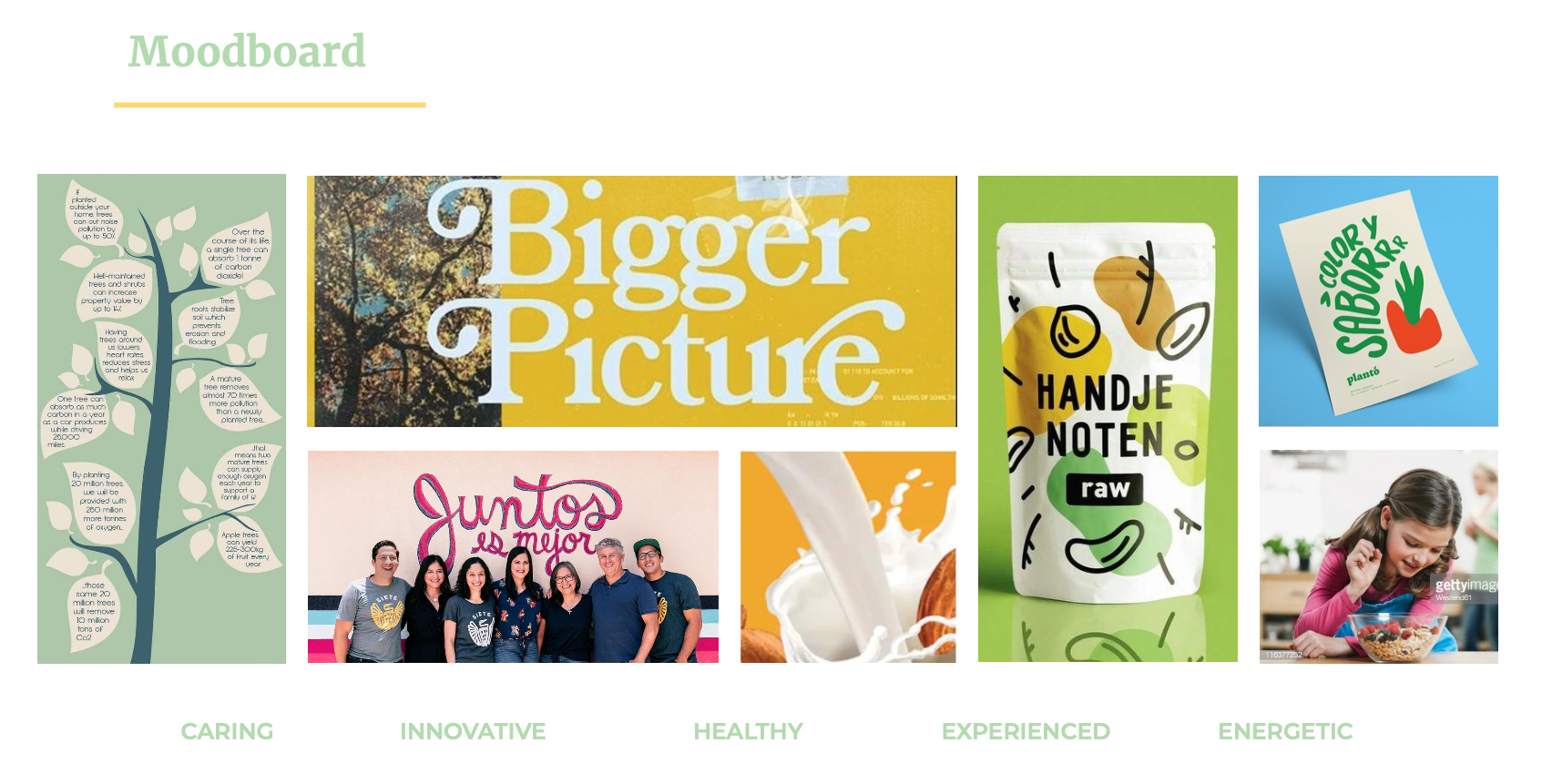
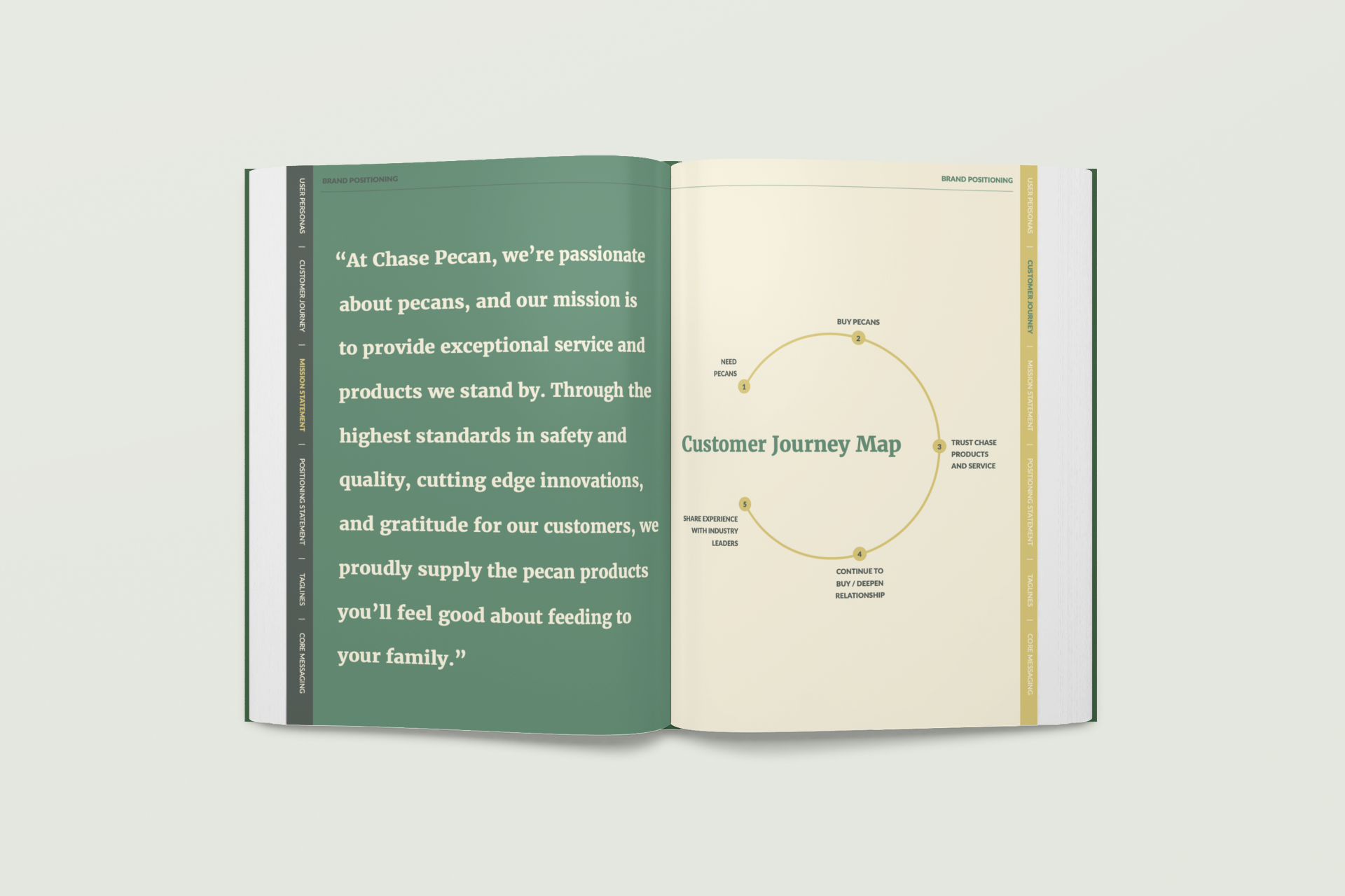
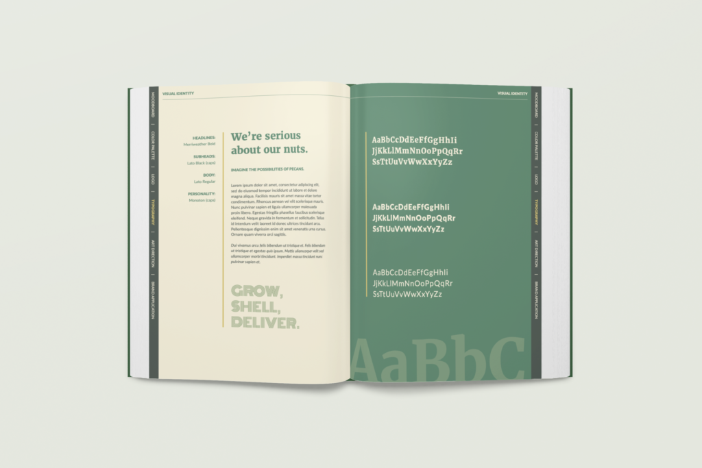
We started by identifying and segmenting key audiences, from seasoned industry veterans to international buyers unfamiliar with the crop. We studied their mindsets, brand affinities, and business goals. From there, we built a brand that highlights Chase’s commitment to quality, education, and long-standing relationships—with a tone that’s confident, friendly, and occasionally cheeky. The final identity is rooted in agriculture and approachability. The logotype nods to neat crop rows, while bold typography, a warm palette, and layered pattern system evoke the natural product and grounded personality. The comprehensive brand book outlines copywriting, color usage, illustration, animation, and art direction for every touchpoint.
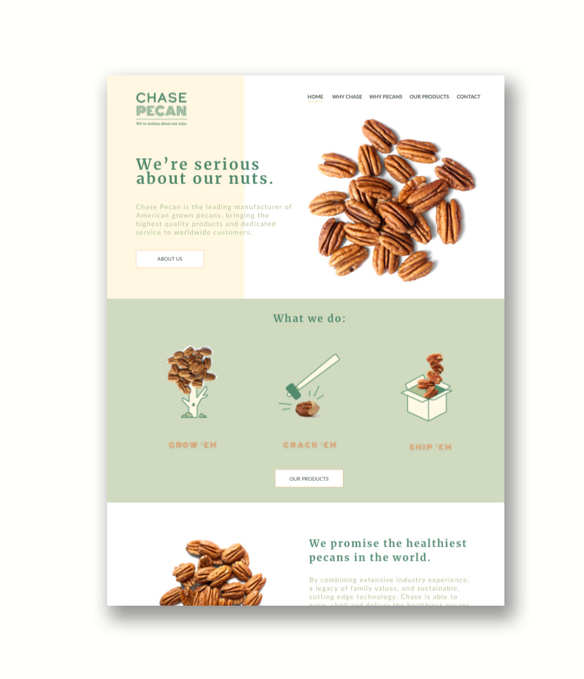
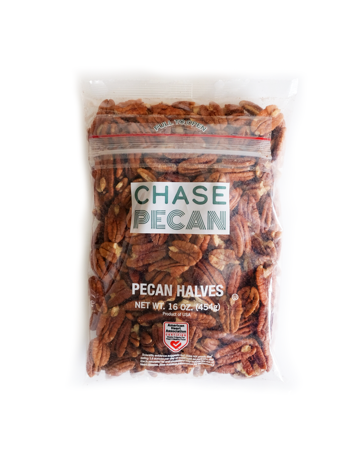
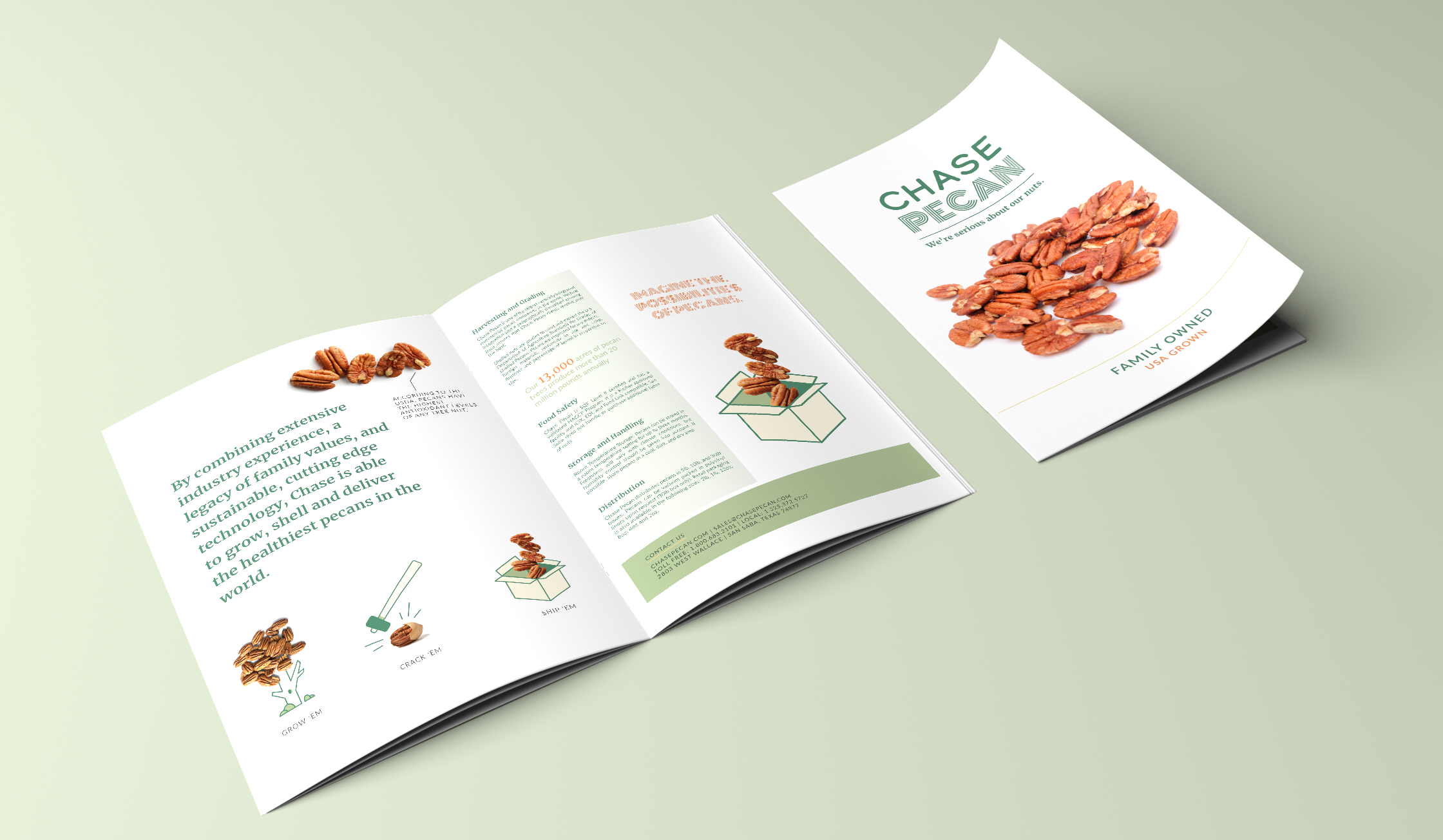
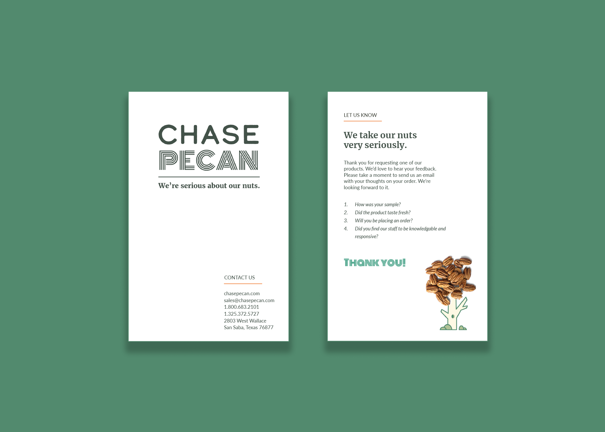
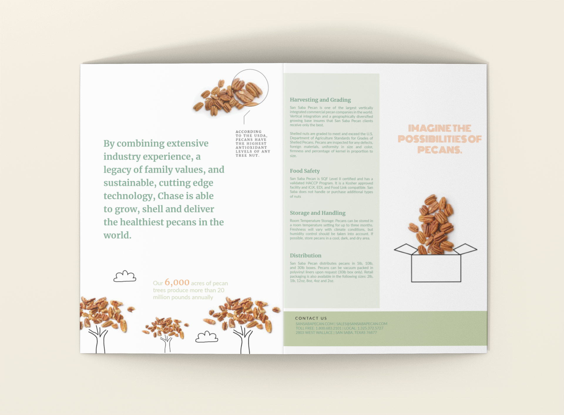
To support launch and long-term sales, we created a suite of marketing collateral and sales tools including a detailed pitch deck, tradeshow displays, promotional items, and a custom website. We also designed packaging for Chase’s consumer product line.
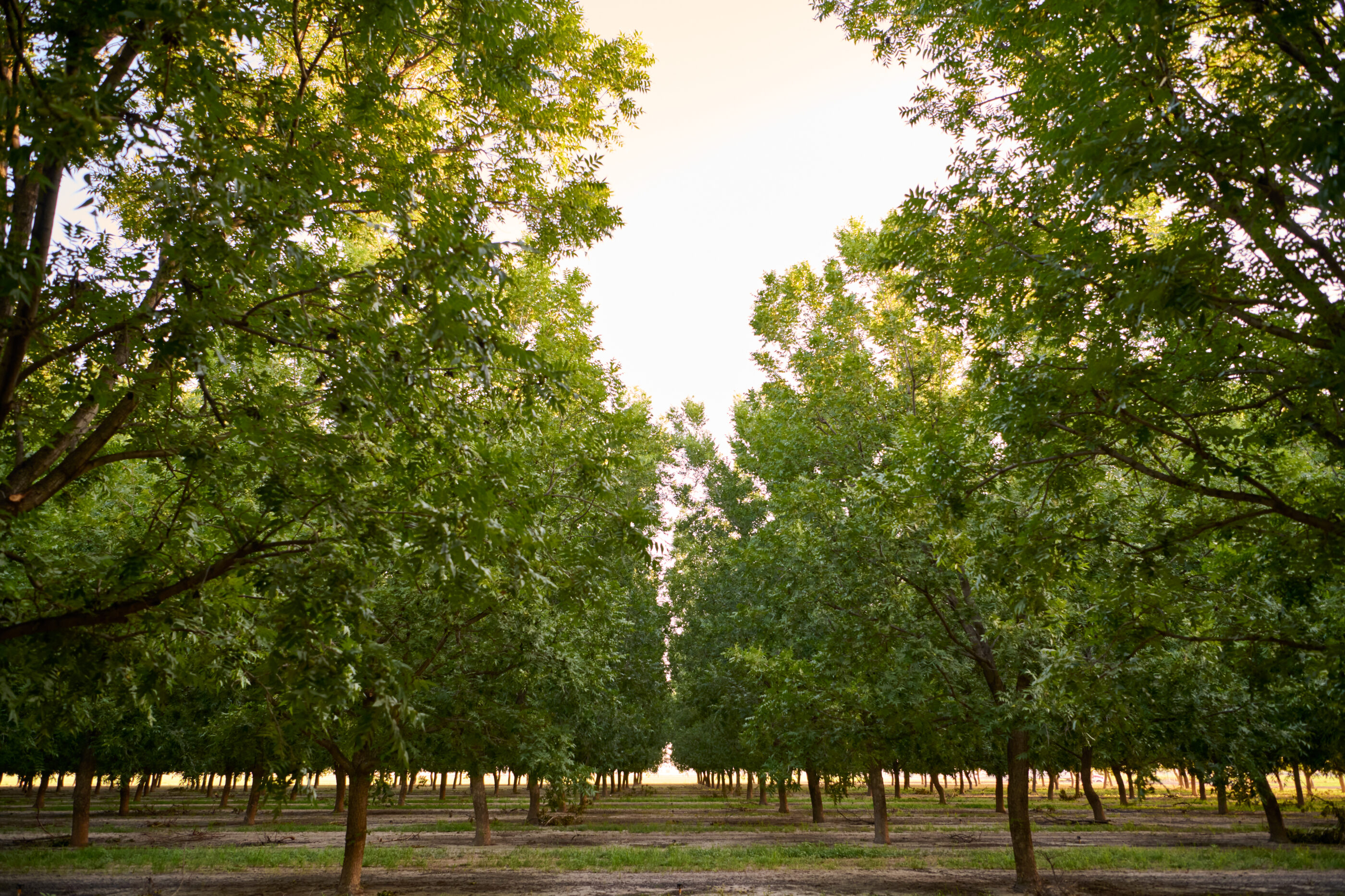
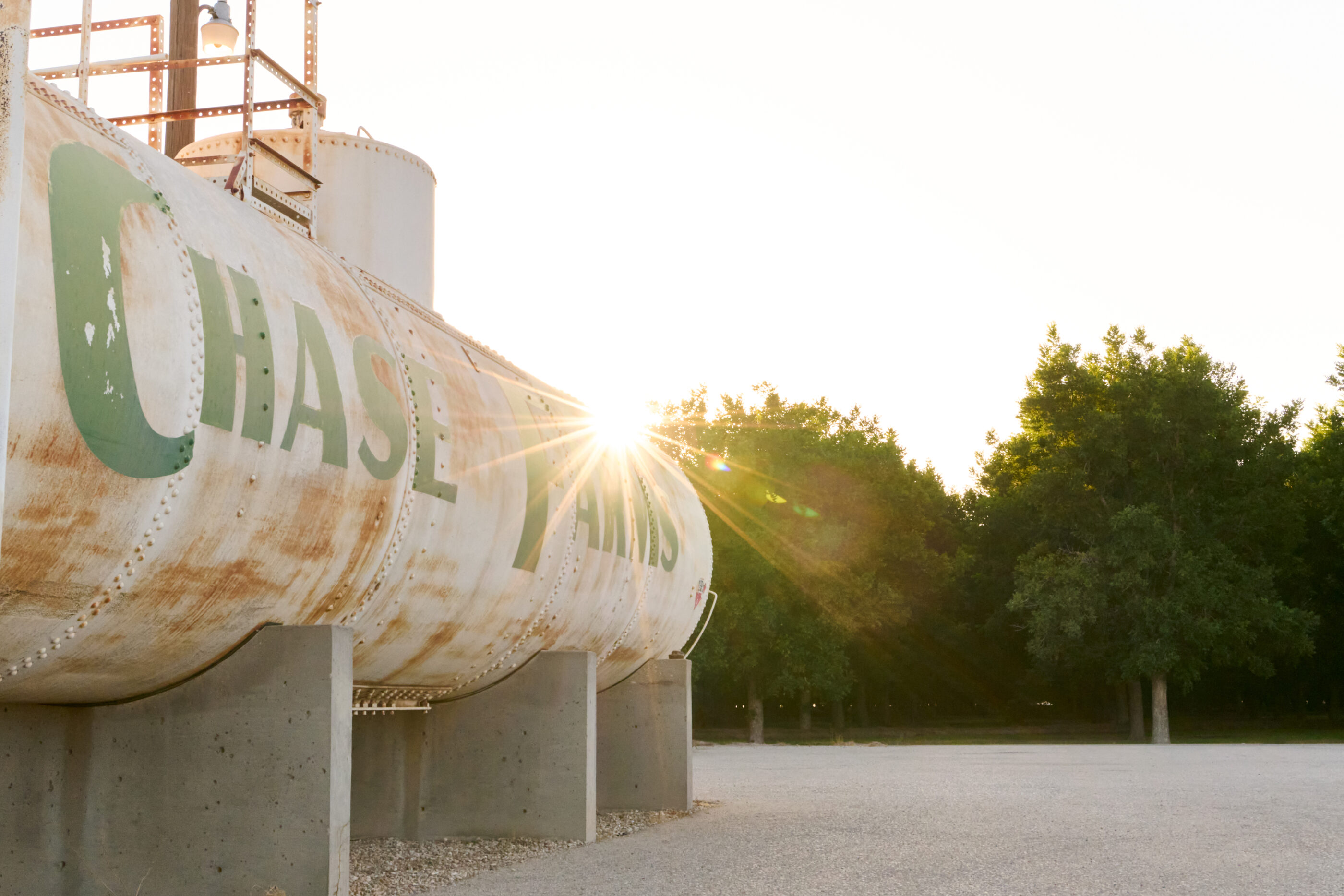
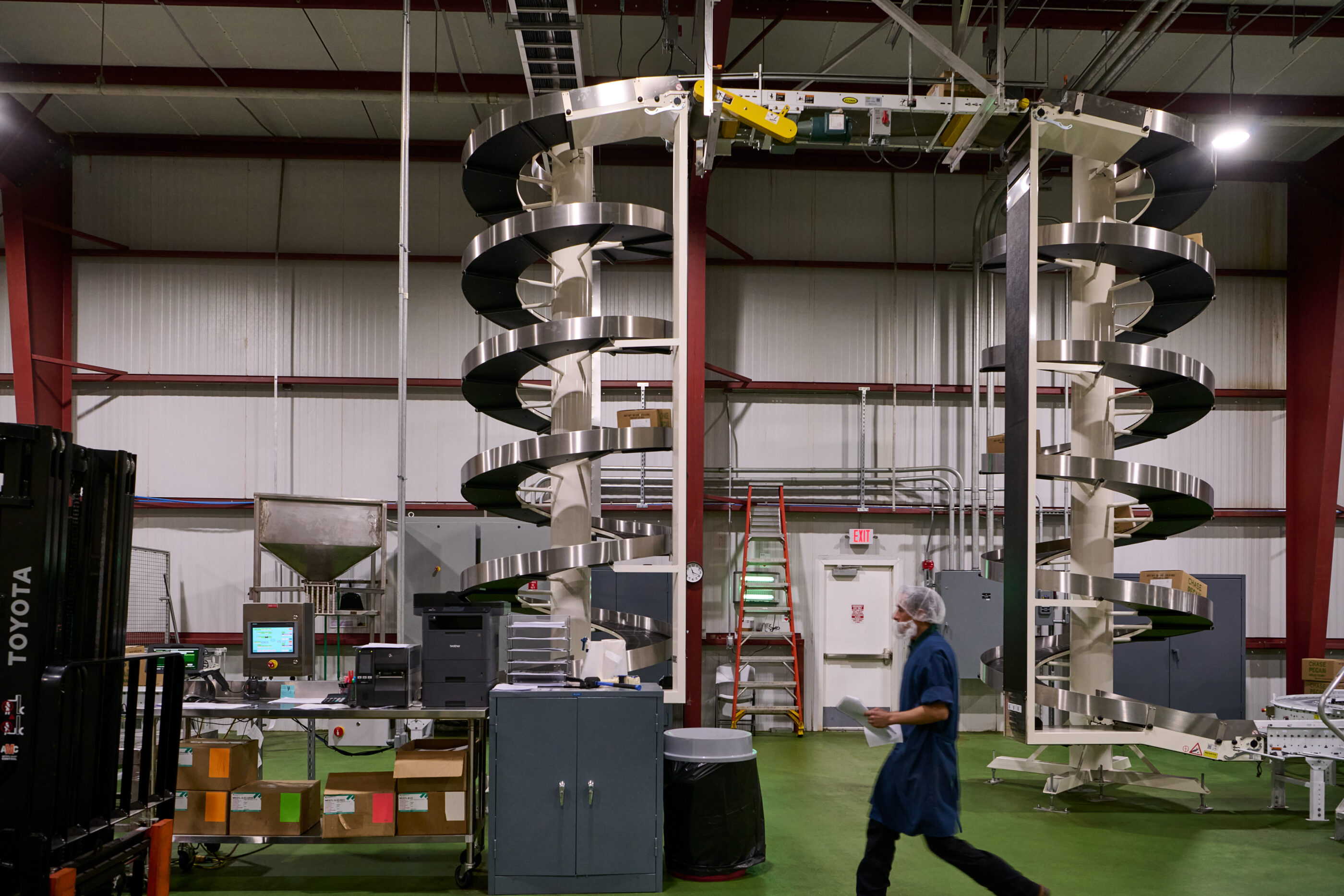
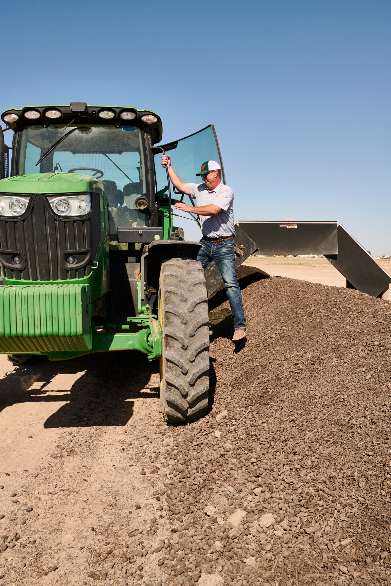
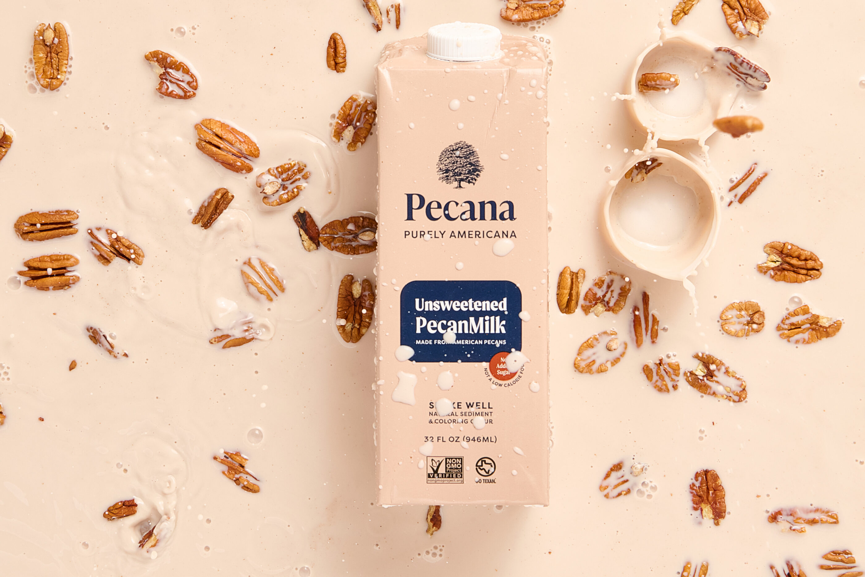
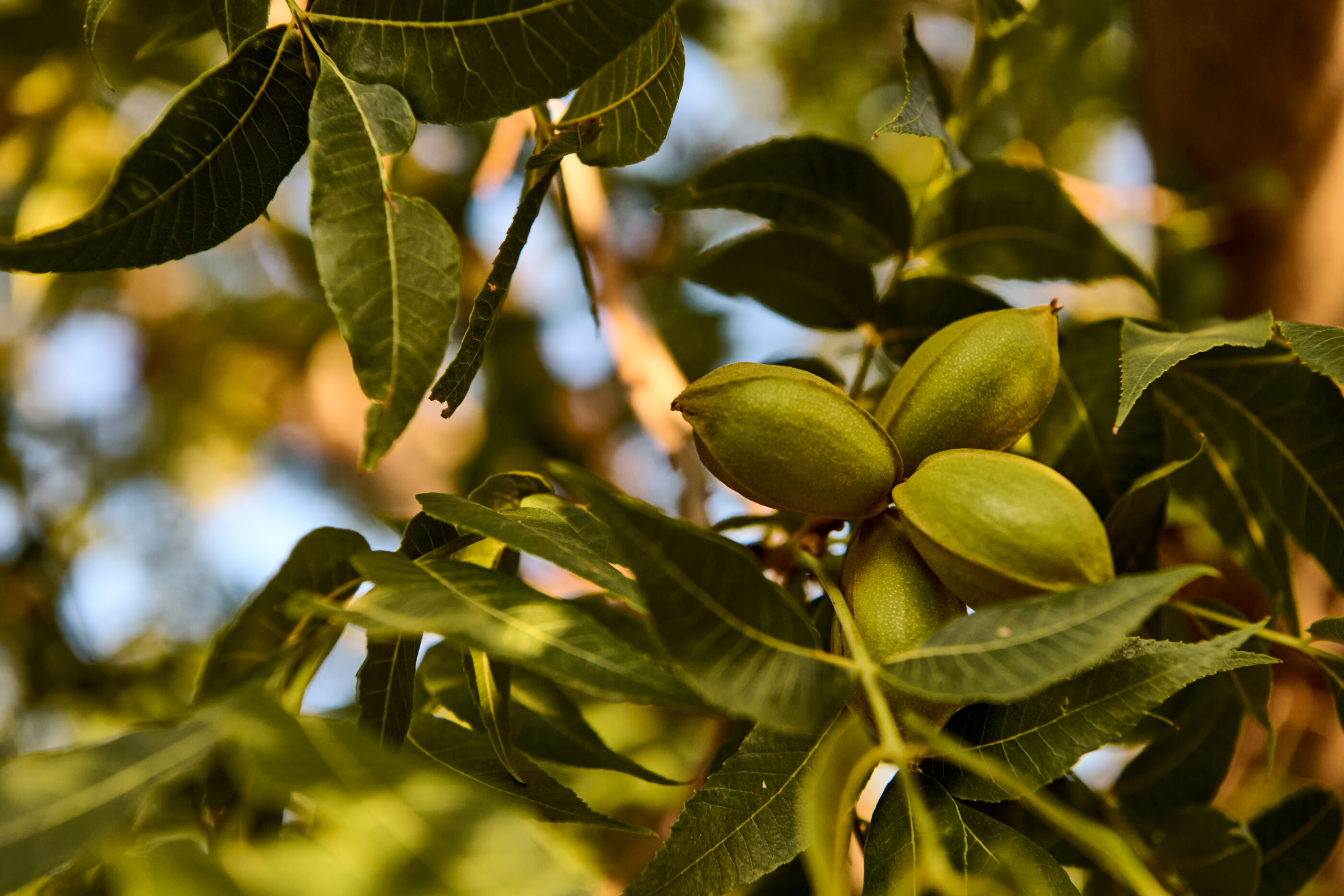
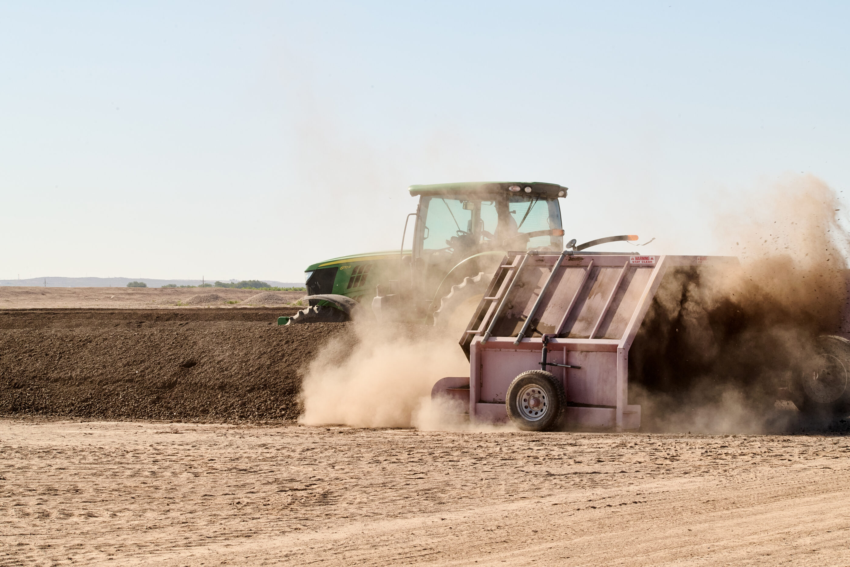
Chase Pecan partnered with PR agency Resplendent and production studio Red Riding Hood to develop campaign photography and branded video assets. STAV helped with art direction, styling, and coordination with the teams to ensure every visual expressed the grounded, confident essence of the brand. We’re proud to help the Chase family create a legacy brand for the next generation of lovers of America’s favorite nut. Since rebranding Chase, we have expanded our relationship with the multigenertaional pecan family to develop their signature (and rapidly growing) product, Pecana—the first organic pecan milk on national grocery shelves.
