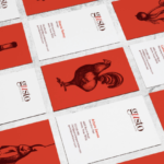
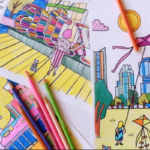
Flashback to the time you were a kid with three Crayons in one hand, scribbling with all three at once on a blank sheet of paper. Turns out, that may have been a useful skill—at least where branding is concerned. Illustration is trending this fall in the creative branding space. Why? Creating a brand has a lot to do with being memorable—standing out from the rest of the millions of other companies out there. Being remembered is half of the battle. Luckily, illustration is one of our fortes.
In order to tap into this memory bank for consumers, it’s important to set your brand apart. A good logo can do that, sure, but what goes along with the rest of the brand identity? We want to create an entire system that is so memorable that even if you forget the logo, there are other visual cues to lead you back to the brand. We’re speaking in vague terms here. Let’s get to the specifics of a few times we’ve done this for our clients:
Lively Beach
Visit Port Aransas in South Texas and you’ll see a stretch of road that’s miles long with beach-front resorts. After a while, they all start to look similar. STAV was tasked with creating a brand for a new type of Port Aransas resort—one that is chic, young, and energetic.
Enter, “Lively Beach”. The branding for Lively Beach needed to be memorable. STAV developed a logo that was unique, simple enough to be recalled, and modern. We didn’t stop there. STAV took an extra step and created an identity system that was complete with simple illustrations, patterns, and typography. Why? Because in order to be memorable, you must be unique. We sat down with a pen and paper, (the adult version of three Crayons in one hand) and went to work. Lively Beach is modern, active, energetic, and youthful. Here’s what we did.

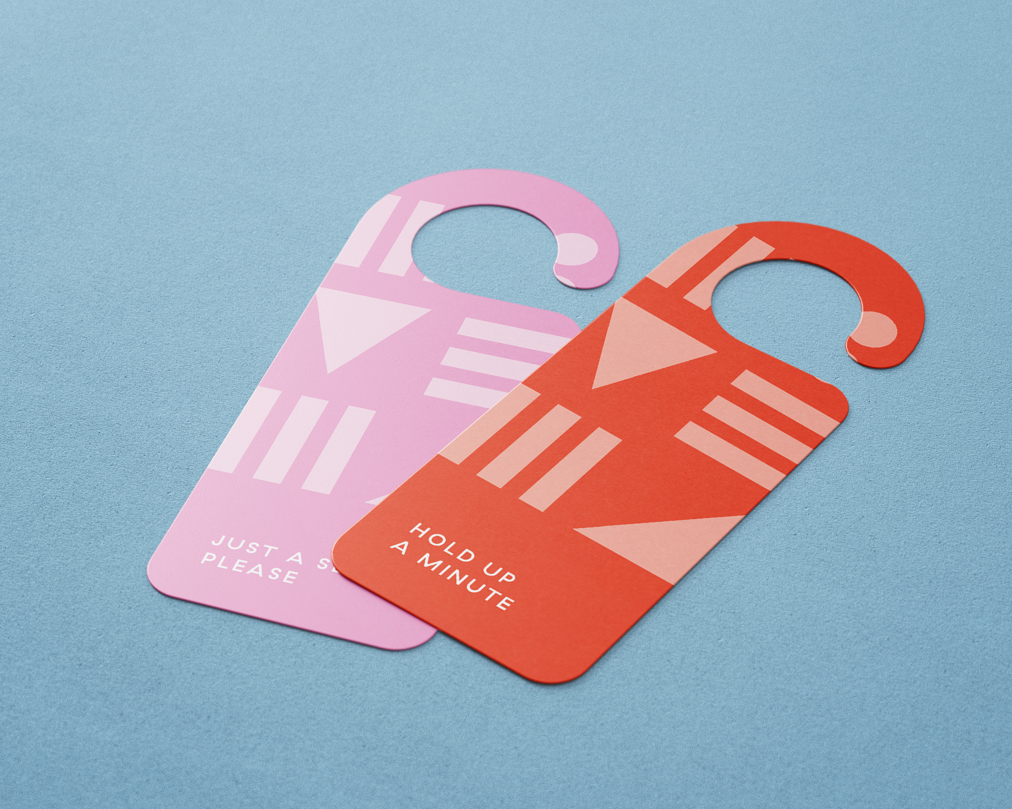

By adding the extra touch of illustration, what could’ve been a simple logo is now a memorable brand. Next time you’re in Port Aransas, stop by Lively Beach. You won’t forget it.
Tribeza Magazine
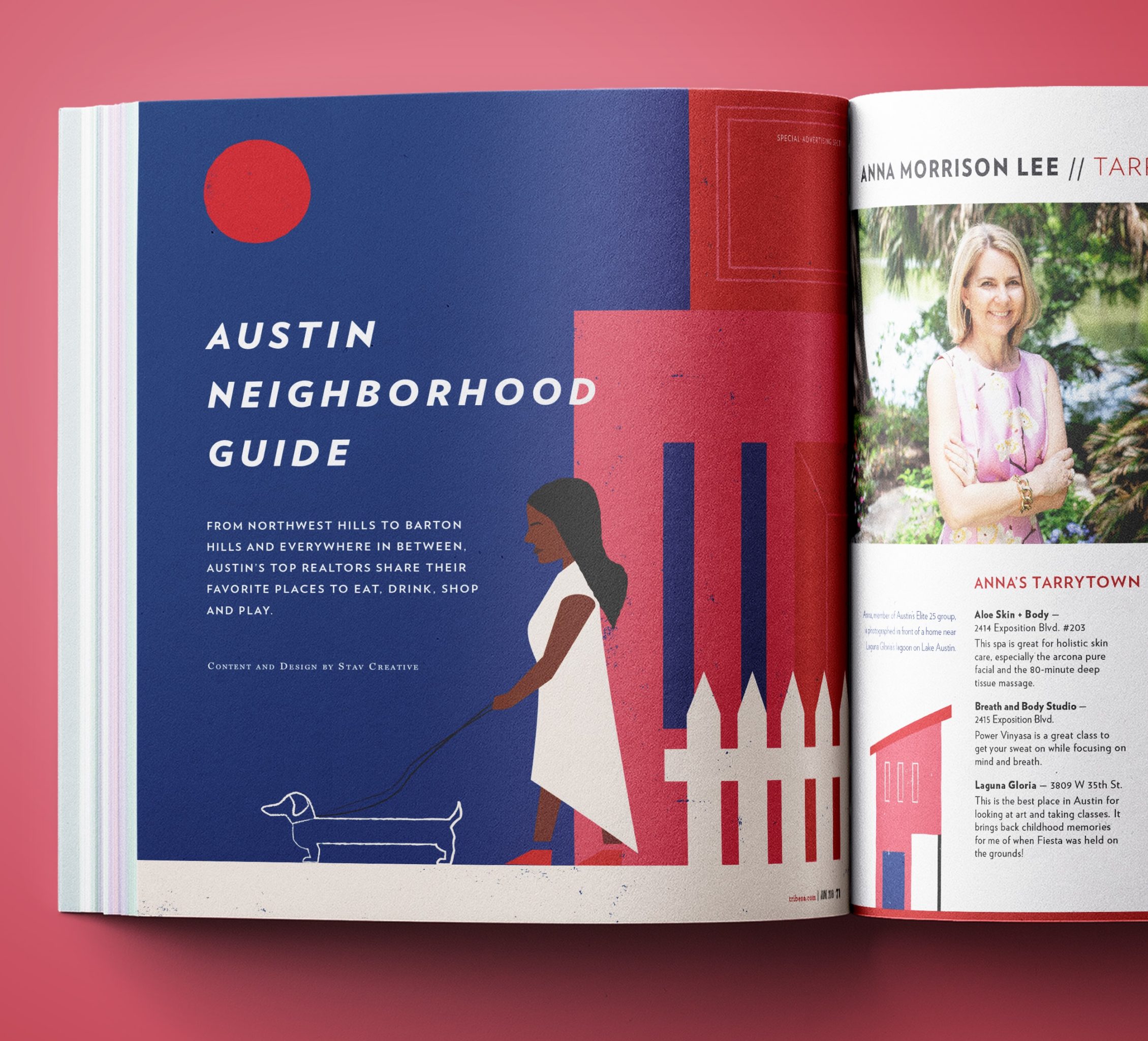
We use illustrations all over our work as well—not just with brand identities. Take Tribeza Magazine for example. We were tasked with designing the layout for the Neighborhood Guide special advertising section. To make advertising more interesting, we crafted a set of house doodles representative of homes found in the Austin area.

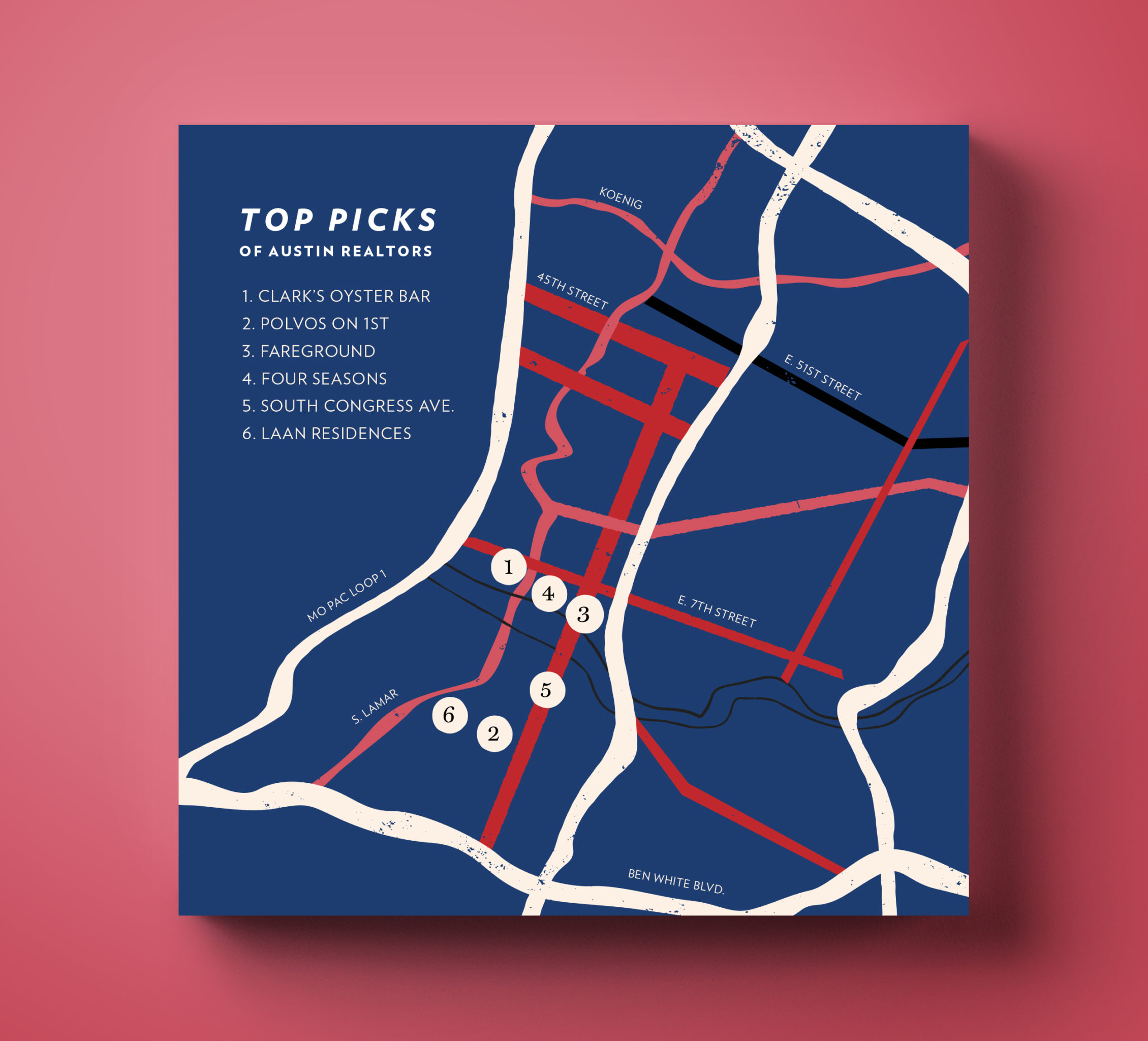
In addition, STAV illustrated a dynamic opening page for the special advertising section and a map for the end of the section. Each illustration acts as an opening and closing to the section, giving the reader visual cues to know where the section stops and ends.
Coloring Book
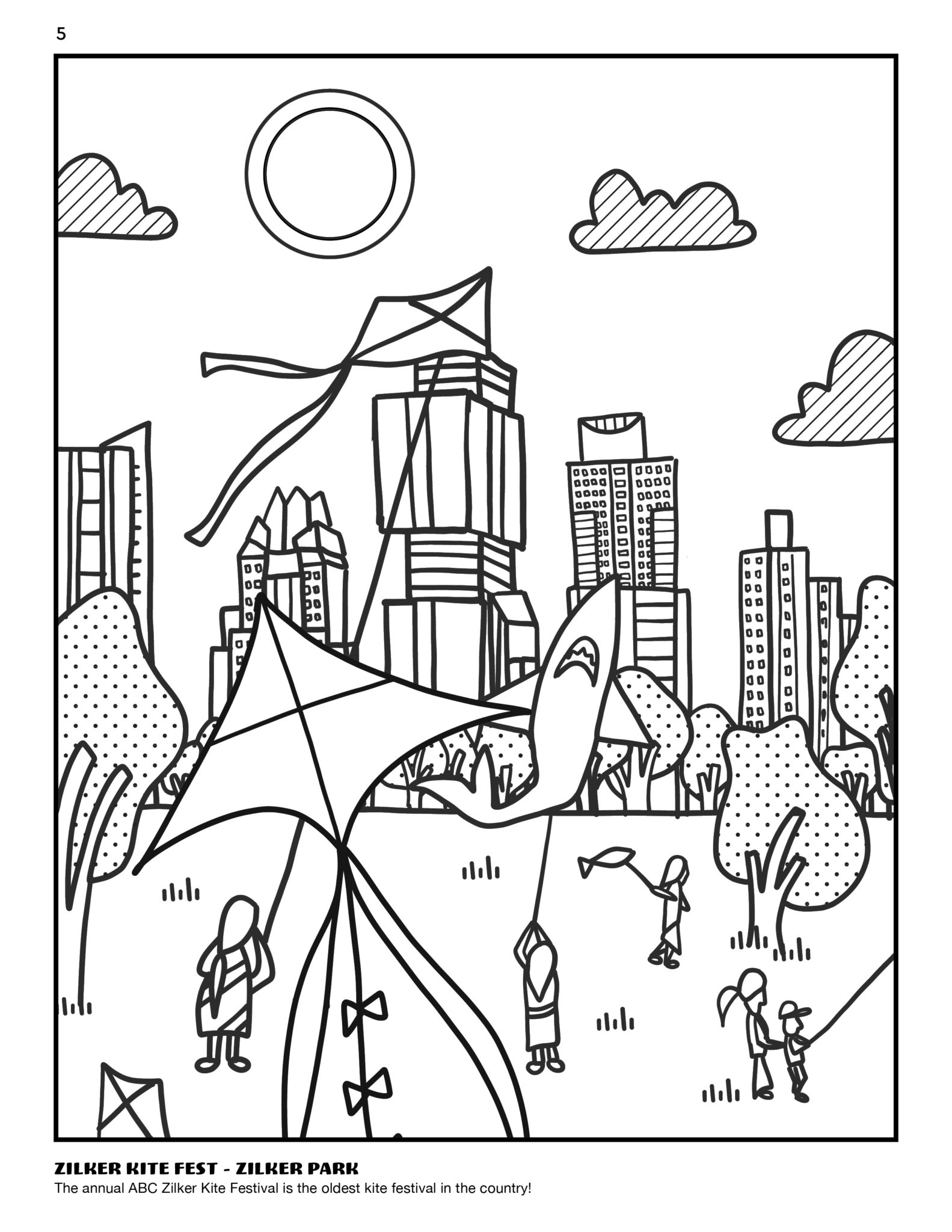
Sometimes our illustration jobs are very literal. We love those too. We illustrated and designed a coloring book for TOWERS Realty in Austin, Texas.
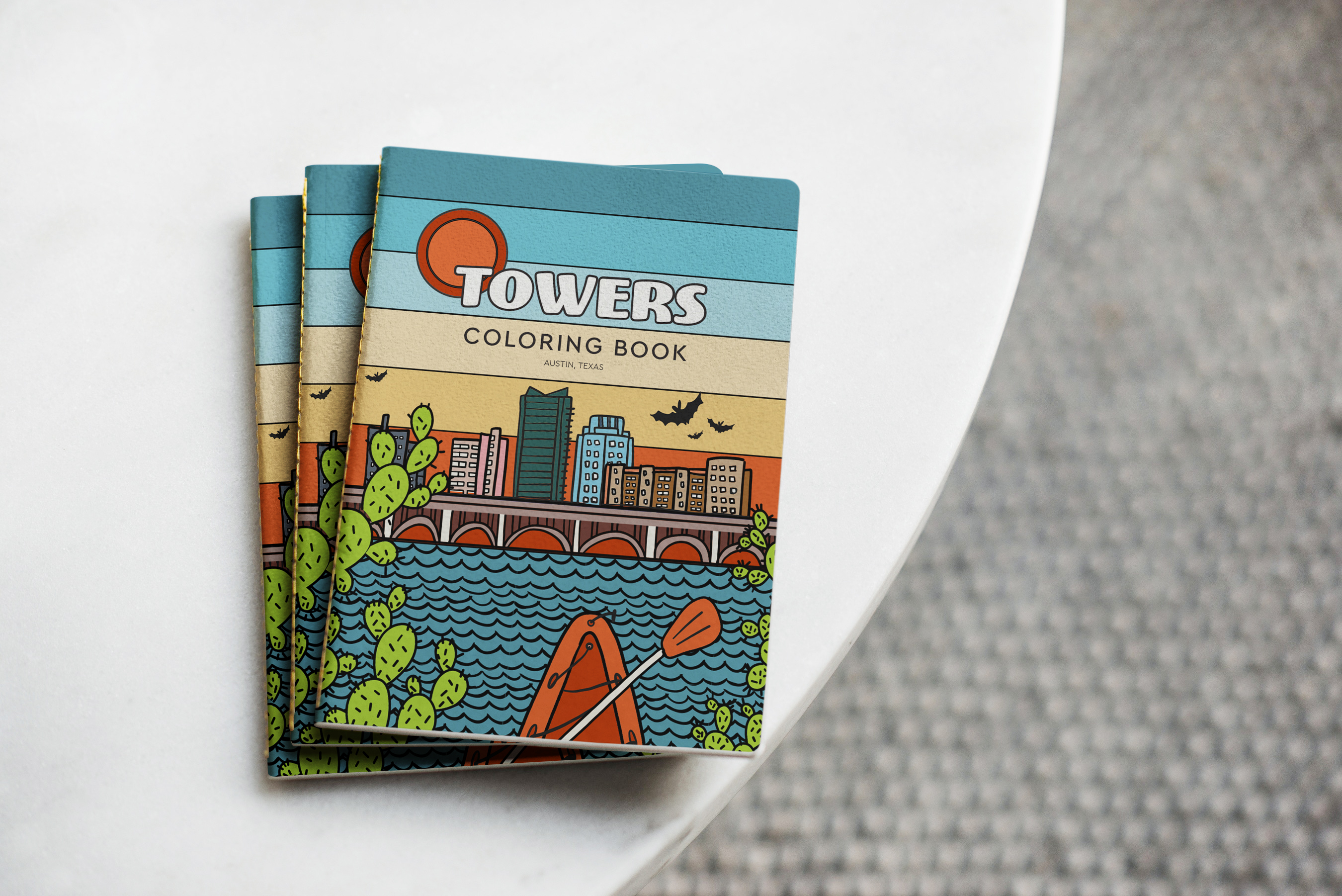
From the front cover to the back cover, each illustration was hand-drawn, imported into Adobe Illustrator, and customized for the book. Needless to say, we loved this project. Coloring for work? We’d be happy to do it again.
Iceland Illustration
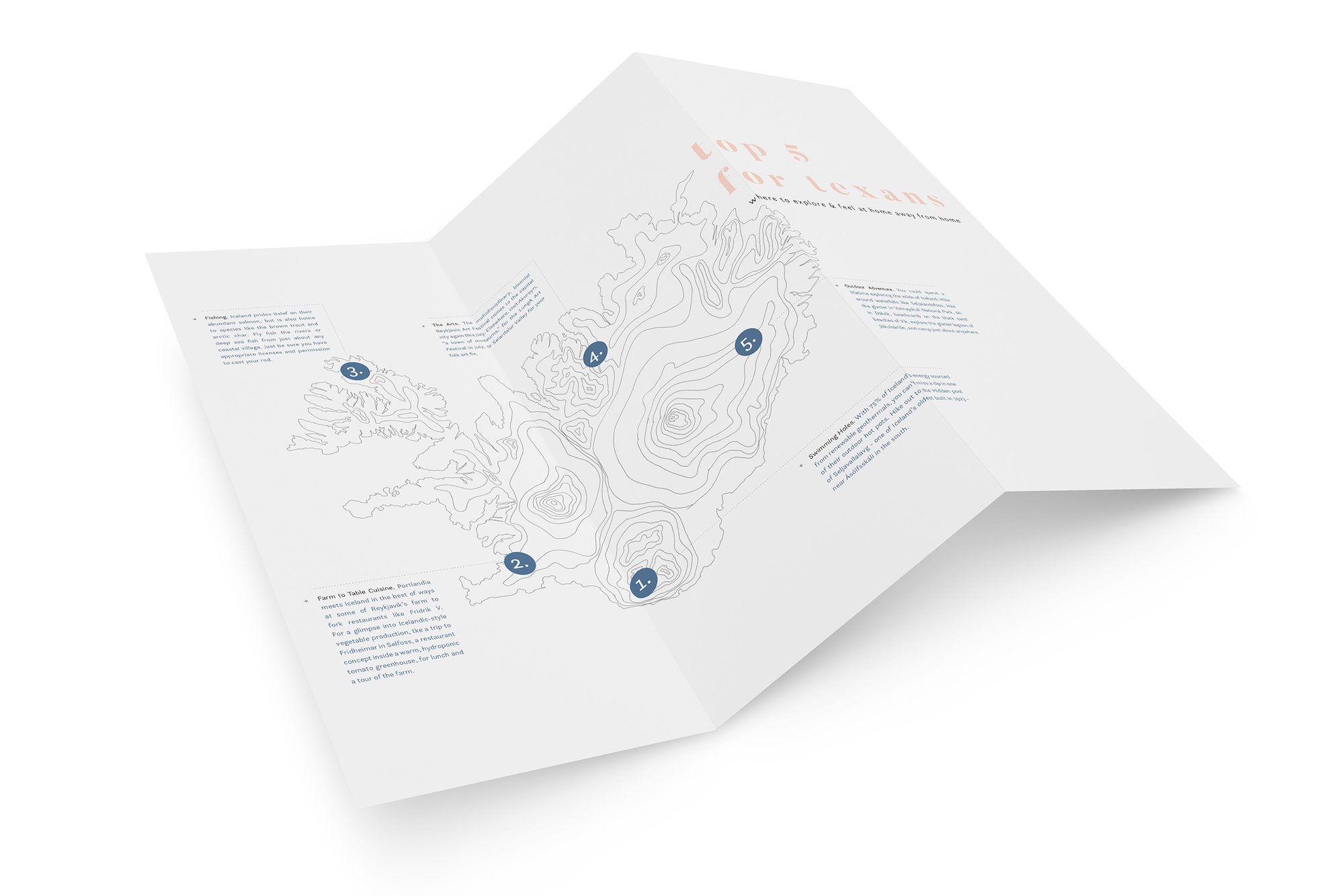
Maps, maps, maps, and more maps. It’s hard to get enough of beautiful design. For a project that centered around Texas tourists traveling to Iceland, we pulled out the iPad Pro and got to work. This topographic map that was used for a brochure highlighting the top 5 things to do for Texans visiting Iceland.
We take pride in the services we offer for clients. Whether that means sketching out custom illustrations, or small doodles for publications, we find an excuse to go the extra mile and take brands to the next level.


